Getting visitors to your website or blog is a huge coup but it’s only half the battle. Once you have visitors, you have to encourage them to stay on your page. If they only spend a few minutes and don’t come back, it doesn’t do you much good—so inspire them to keep coming back for more.
Create an Eye-Catching Logo

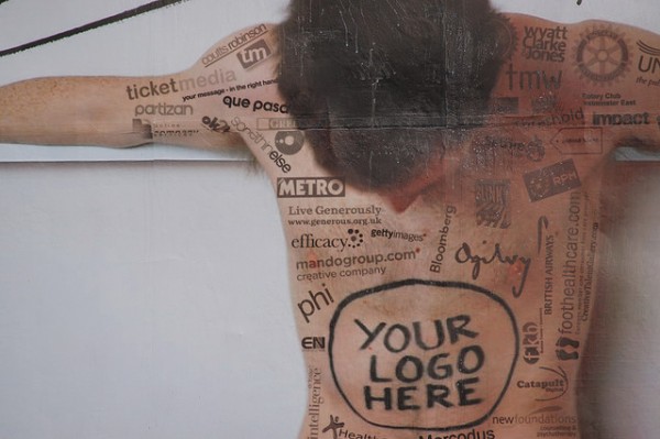
Image via Flickr by jystewart
Your logo is one of your top priorities. Ideally it’s what visitors will notice first when they visit your site. To make it more recognizable, use it everywhere:
- Your business cards
- Your brand’s Facebook and Twitter pages
- Your LinkedIn resume
- And as your avatar when commenting on blogs and websites yourself
Whether it’s a charming little blue bird, a stylized version of your initials, or a creative, outlandish design, make sure it’s vibrant, clear, and prominent.
Make Everything Relevant
Your logo, graphic design, and accompanying images must stay relevant to what you’re offering. If you’re writing about cars but you’ve got rainbows and kittens everywhere, people are going to feel confused, not intrigued or interested. Even if you’re writing about spring makeup and include pictures of dark, dramatic looks, visitors will question your credibility. Every category, blog post, and image must have something to do with what you’re offering.
Write Intriguing and Emotional Content
You may have a site selling car parts. You might have a blog showcasing parenting tips or how to improve your golf swing. Whatever your aim, always make sure there’s a method to your madness. Never post a blog entry or article unless it’s flawless, captivating, and emotional. Don’t publish product descriptions unless they’re concise but attention-grabbing. Pull in your visitors through the sheer brilliance of your content. Intrigue them and they’ll stay longer, tell their friends, and visit you regularly.
Ensure Easy User-Interface
Keep everything simple and easy to navigate. Don’t use ads that take up the page. Don’t require visitors to go to some other site to learn more about a topic, share it yourself. Every click should matter somehow. Don’t clutter your site with any unnecessary graphics or features. Make it attractive but simple, clean, and classic.
Tempt Them with Your Graphics
Phenomenal graphics aren’t just important, they’re vital. Not only should the design of your site look spot on and eye-catching, it should inspire visitors. Don’t choose a color scheme just because it looks cool, make sure it’s cohesive. Don’t stop at your background graphics, header image, or logo either. If your page has a blog, include images. People respond to visual stimulation, so if pictures accompany every article, it increases the length of their visit.
Streamline the Browsing Process
Make everything streamlined and smooth. Each post is in one category and categories are easy to find. Make sure your visitors can quickly find whatever they need. If they have to work for it, they’ll lose interest. Get rid of any unnecessary material. If it doesn’t help build your brand or provoke positive responses, it’s just taking up space.
If you offer interesting content or services that grab their attention, your visitors will want to stay. Have you ever accidentally turned visitors away with a particular feature?
About the Author: Shaun Chatman is a well published author on many authority sites. He lives in Dunedin, FL, and spends his free time playing with his kids or advising friends on tech, gadgets, finance and travel.


Very useful. Am convinced this is one of the best sites i’ve visited.