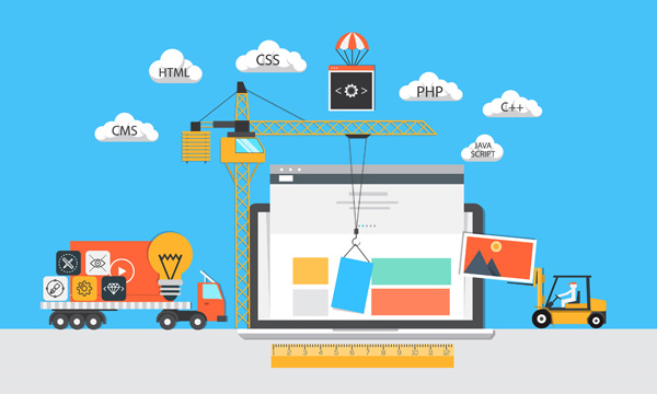
During the mid-1990’s, when web design really started to pick up, sites had come along way in a short period of time. The first website, which went live 1991, was as plain as you can get with text and hyperlinks, but just a few years later, graphics made their arrival on websites. Although it was an exciting and “anything goes” time for web design, websites were often cluttered with multiple types of font and bright colors that were hard on the eyes. Needless to say, the graphics you choose for your website matter. Here are some tips to help you build a visually appealing website:
Don’t Forget About First Impressions
How many times have you come across a website that left you feeling less than impressed? Did you give it a chance or did you move on? Even though that site may have been filled with all the information you needed, it’s likely you didn’t give it much attention if it lacked in graphics. When building a website, graphics are more important than you may think as they can make or break a first impression. If you want to catch an internet user’s attention, choose a strong or unusual image or illustration as well as wording that is memorable.

Other graphic elements that people look at first include a branding or logo, main navigation to see how the site works, and a written message in large lettering. Remember, with the nearly billion of websites on the internet, it’s a competitive world; you must step it up and make a good impression with your website and graphics are an easy way to do that.
Be Relevant
The imagery you choose for your website should be relevant to the content you have on your site. Whether you are using original content or stock photos, relevance is key. Think of your website as a picture book. If you decided to read a book about gardening, but saw no pictures of flowers, plants, or produce, you’d probably look for something else. Don’t pick an image to accompany your content just because you feel like you need to fill or break up space, but rather choose something that helps back up your content and sells your product or service.
Even if you are using a website builder, like websitebuilder.com, where you have the opportunity to select a template for your site, make sure that the template (with text and graphics) is relevant to what your site is representing. If you don’t see something you like, you can always customize.
You Are Your Image
Whether your website is for personal use (such as blogging or your art portfolio) or an ecommerce site, the images you display on your site reflect you and your product or services. It’s estimated that 67% of consumers prefer businesses that provide clear and detailed images of their products (yes, product descriptions matter as well). In a rush to get your newest product online? Don’t rush through the process of choosing good graphic material. You know how a picture is worth a thousand words? That goes for bad ones, too.


Comments