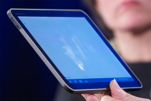
Google has really surprised everyone when they announced and demonstrated an early version of the Android 3.0 OS, code named Honeycomb, just a couple of weeks after they officially set a release date for Android 2.3 Gingerbread. Not only that, but they also did it on an as-of-yet unannounced Motorola tablet, most likely the rumored Stingray.
The presenter, Andy Rubin, said that the tablet will be released “soon”, and will feature the 3.0 version of Android out of the box. Everyone hopes that the device will be officially announced during the next CES, which is due in just a few weeks.
The new tablet runs on a next generation platform from NVidia, the Tegra 2, which features a dual core processor and a very powerful (compared to current solutions) video graphics adapter, made possible by NVidia’s extensive experience in the field.
This is exciting news, and if the Stingray is released in the beginning of 2011, it will be the most powerful tablet on the market, and has the potential to become the next Droid for Motorola, which would definitely benefit their dwindling profits. Motorola themselves did not say anything about the device, but judging by the amount of rumors and the prototype, I’d say its release is pretty certain.
The tablet features a 10 inch display and takes full advantage of Android 3.0, which has gone through a pretty major redesign in order to support both small smartphone screens and bigger tablet displays and resolutions. Google has already stated that they made a mistake by overlooking this feature in the previous versions.
The interface of Android 3.0 on tablets will look more like a traditional one on desktop PCs, with smaller menus and buttons relative to the screen size and resolution, so you can fit more on a screen and still have excellent control, as opposed to the current 2.2 Froyo, which pops up huge menus that fit a whole 10 inch screen, even though a smaller version would be better.
In order to make apps work well on smartphones and tablets, Android developers will now be given 2 different APIs for the user interface: one for screens smaller than 5 inches and one for bigger displays. Basically an app will have 2 possible layouts pre-programmed, and it will automatically choose one depending on which device is detected. This is the same solution that Apple used with the iPad, which runs on the same operating system as its smaller brothers, the iPhone and iPod Touch.
The presentation didn’t reveal much, but the demonstration of a new version of Google Maps using NVidia’s 3D technologies to render streets in real time was definitely impressive, and Andy said that the final version should be even better. The new Google Maps uses vectoring to create the streets and navigation, so the maps are much smaller, and the rendering can work even if your phone/tablet drops the Internet connection, which is pretty cool.

Another impressive feature of the new Android 3.0 that simply needs to be mentioned is the lack of need for the external navigation buttons. Newer smartphones and tablets won’t need the four Menu, Back, Home and Search buttons, as they are integrated into the virtual screen, and can be hidden automatically or even replaced by gestures with a third party app!
This means that they will no longer occupy precious space on a device, and as the Motorola tablet demonstrated, the users will be able to use their device in any position. You can pick it up upside down and you won’t notice a difference, as there is no “right way” to hold it thanks to the virtual desktop, which rotates according to the orientation of the device.
On smartphones, this is useful for example, in one hand operation, where it is pretty difficult to use a 4 inch (or smaller) display without accidentally pressing the wrong button or trying hard to reach the rop edge of the screen.
Overall, the demo of the future Android 3.0 and the Motorola tablet was pretty good and set the expectations to a new level. We hope that eh end product will be even better and feature-filled, and all we can do right now is wait.


Comments