Apple has recently announced iOS 7 ? its revamped operating system at the WWDC ’13, which introduces a lot of new features along with a reinvented interface. The iphone 5 is still the best selling phone in the UK according to Uswitch’s research. We are not sure if this is because of its competitive pricing. You can get the iphone 5 for free at £33 from Carphone Warehouse with 500MB data while the cheapest entry into the Galaxy S4 would only give you 250MB Data. Anyway here’s a guide to the iOS7:

New Design
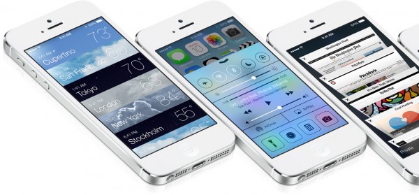
The first thing you notice is the new design; Apple has ditched its old design language and gone for a new and more colorful, yet simple layout. The background features multiple colors and even the font has been revamped. There are new icons and visual effects too. The UI is modern, and everything is more polished. The weather app shows fullscreen weather, with the calendar app being cleaner and more functional. The lock screen has also been redesigned and now offers access to the camera, notifications and the quick settings panel.
Control Center
This is a menu that can be opened by swiping up from the bottom on any screen and has shortcuts to apps and some other features. Music can be played or paused, the flashlight can be turned on, apps can be opened and the brightness can be adjusted all from a single pop-up.
Airdrop
Airdrop can be used to send and receive photos, videos, contacts and more to other iPhone devices by tapping the “Share” button, but this function is only available on iPhone 5
iTunes Radio
This is an online radio streaming app that learns what type of music you like and recommends you similar songs.
Multitasking
iOS 7 makes multitasking easier with a new screen that shows the opened apps along with app previews, and any app can be closed simply by swiping it up. This can be accessed by double tapping the home button.
Notification Center
The new notification center is cleaner with a new tabbed interface. There is one tab called “Missed” which shows all the missed messages and calls, while the “Today” tab is an overview of what’s happening in the day, including the weather, events and traffic.
Camera and Photo Gallery
The camera app is designed for easier access and different modes can be accessed by swiping at the bottom of the camera viewfinder. Filters can also be applied from within the camera app. The gallery app is also revamped, and the photos are now sorted by year, collection and moment.
Siri
Siri is now faster than before and features a new look. New voices are added to make the experience more realistic. It will use Bing for search services instead of Google.
Safari
The buttons and address bar appear only when you scroll, so you can view all your websites in full screen. You can go backwards and forwards by swiping left or right. Passwords are saved by Safari, and the Password Generator gives you hard-to-crack passwords that Safari remembers.
Compatibility and Release Date
The new version of iOS is compatible with iPhone 4, 4S and 5. It is also compatible with iPad 2, iPad with Retina Display and the iPad Mini, along with the Fifth Generation iPod Touch. It is expected to arrive this fall, probably in September.


I have been evaluating iOS7 on my iPhone 5 for the past week. Being truthful I fell a bit tepid regarding the whole experience. After years of design innovation exactly why have Apple made the decision to make their OS seem like a poor relation of Microsoft’s Windows 8. On the other hand it seems to have borrowed heavily from Android. You can now swipe up to turn on/off WIFI, bluetooth, much like Android.
In summary I enjoy: Newsstand, the integrated flashlight, screen transition, new compass interface and email interface.
I don’t like: no mass erase function in the mail program, it’s still message by message deletion. The pseudo windows interface and menu movement. The settings menu is a bit of a waste land of white space. Just like an aging married couple I am finding more faults with it as time passes but I grow to love it the more time I devote to it.