Remember back in the early days of the Internet, when everyone had an over abundance of animated .gif files? For the most part, those particularly annoying days are long gone, however, new abused trends and elements in web design have popped up to take their place in the modern era.
Internet trends rise and fall. What seemed like a cool and innovative idea months ago may become old hat quickly. The Internet public are a fickle bunch, and what begins to grate on their nerves changes quickly and often without warning.
The most unfortunate thing about the use of most of these abused elements is that the company or web designer that uses them thinks that they are being innovative and cool. Unfortunately, when following the trends half of the rest of the Internet is following, it is neither, it just becomes hackneyed.
Stock Photos
If you’ve ever been to a corporate website and thought to yourself, “I’ve seen this picture before somewhere,” then you have been the victim of stock photos. Company websites seem to love these, perhaps not realizing that the same photos of the frizzy haired lady with the glasses are showing up on other websites across the Internet.

Unfortunately, it’s not just the small mom and pop company websites that make use stock photos. Larger corporations, in an effort to show an utter lack of innovation and creativity, often are more guilty than smaller companies of making use of stock photos.
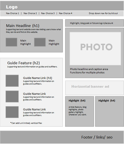
Image Carousels
Image carousels are extremely distracting to many people. Though this is certainly a solution to having a webpage filled up with tons of images to scroll through (see also the Internet circa 1999), it might not be the right solution.

The automatically moving and changing images can easily be distracting enough to become the mental focal point of the site for the user. This can take away from other pieces of information displayed on the site, which can end up being a self-defeating design choice.
Flash Intros
Flash introduction screens, if used properly, can be an effective tool. However, few websites use them properly and, because they have become so common, using one shows a real lack of creative innovation for the most park.

Even worse than the Flash intro is the Flash intro without the ability to skip said introduction screen. In this case, the user is something of a prisoner, unable to move on with the website until the intro plays out or they give up in frustration and move on to another website. Either way, it is not a positive experience for the surfer.
Media That Automatically Plays
Fortunately, this is not as much of an issue as it was a few years ago, but it still pops up far too often. In the olden days, it was music, but in modern times it’s video.

When a surfer pulls up a site, it begins blaring music or showing the video automatically. This is the internet equivalent of loudly yelling at someone while they’re doing something. It’s jarring, it’s annoying and it is completely and utterly distracting.
Rollover Ads
Everyone got annoyed enough with popup ads on websites that browsers finally put in the ability to pop them. So, the obvious solution? Ads that if you so much as bring your mouse close to them, they pop open and take up most of the screen real estate, often with hard to find boxes to close the ad. Even worse, sometimes, this is combined with video that automatically begins to play when the rollover ad pops up.

Faux 3D Buttons
Glossy buttons give the impression that they are “three dimensional,” thus making the button pop out at you. Unfortunately, like image carousels, they tend to dominate the page and distract the reader from the page’s true content.

Overly hyping Social Media
While few business owners would disagree that having a social media page for your business is a good idea, if you are paying the money for website hosting for your business’s website, it doesn’t make sense to treat the social media page as your main page.

Mentioning that a social media page exists once or twice is fine, but if the majority of your real content is on the social media page the business should perhaps reconsider whether it needs a non-Facebook page at all. Instead, companies should consider using their social media page to direct fans to their main home page.
Too Many Like Buttons
Whether it be a “like” button, a “tweet this” button or a “+1” button, there are definitely a limit to the number of these sorts of “share it” buttons that should be used. There are a plethora of sharing and social sites out there, and picking two or three buttons to include is fine.

However, if a site has six or more sharing buttons, then that may very well fall into the category of “overkill.” In these cases, the lists of buttons may be longer than the article itself!
Article with help of NiceDesign, graphic design studio http://www.nicedesign.biz/


Comments