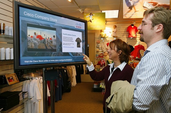
Digital signage is used for many purposes, for example for advertisements, displaying weather conditions, and promoting brands. It can appear outdoors, in sports arenas, shops, airports, pharmacies, in short, approximately anywhere. Digital signage is simply a form of sign using technologies such as Liquid Crystal Displaying or Light Emitting Diodes to communicate to a viewer. In essence the signs you see on the London underground are no different to the old posters of the same promotional format that used to appear on all the escalators and now appear to be being phased out. However, they can move, and be changed in bulk more easily and quickly. Some digital signage can even be interactive. The potential of it is strong, but bad signage is still an issue, and in the case of digital there is no excuse.
In the past, and in more remote areas, the only signs you see were hand painted. Signwriting was and to some extent is still an actual job, and expert writers would render type painstakingly, constructing letterforms with serifs, or readable script depending on the context. A bad sign was at least a charming sign. Now using software to create digital signage bad typography is now bad digital typography, and unstimulating photographs replace naïve illustrations. The majority of work for large companies is decent or at least passable, visually, but as the technology becomes more accessible we might start approaching the equivalent of the comic sans emblazoned tombstone, a visual clanger so inappropriate as to be as funny as it is criminal.
When everyone and their mother-in-law got their hands on desktop publishing software in the 90s, home printed posters for events and invitations started appearing with oddly placed and indelicately chosen clip-art communicating the content at a glance. This visual short hand was useful, but it was ugly. Vector art has improved since then, but the tactfulness of its use has not always followed. A couple of years ago there was a fad for erasing the dreaded grocer’s apostrophe, an act of corrective vandalism that will be out the window when grocers begin using LCD screens to sell carrots, no doubt with a smiling bandy legged potato star-jumping beside for lack of a default image of the correct veg. Its easy to choose the charming naivety of a grocer’s misspelled blackboard over a gaudy and poorly laid out screen. Digital signage may be a field full of potential, but it has the potential to be a popular design calamity. As such, it’s best to leave it to the professionals.
Written by Omar, who works for Reflex.co.uk, specialists in audio visual systems. As well as being an analogue enthusiast, he also loves retro furniture and can often be found listening to music…on vinyl of course


Comments